There are so many free templates available for Looker Studio (Formerly Data Studio) that it’s easy to just pick one and go. The problem is when you want to have a report that is completely customized to your website or application so you can have access to only the data you need.
In this quick guide, we’ll design a basic 2-page Looker Studio template from scratch using Google Analytics as the data source.
Before you start
Here are some things to know before you begin this process.
- You should register for Looker Studio using your Google account at https://datastudio.google.com/
- You’ll want to have access to a Google Analytics property like Universal Analytics, or Google Analytics 4.
- Consider creating your report on a Desktop computer to make things easier.
How to Set Up Your Looker Studio Report
From the Looker Studio home page, select Create > Report.
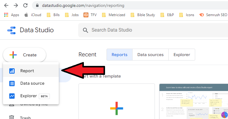
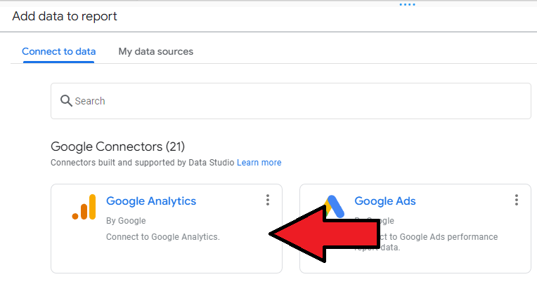
Select a connector, such as your Google Analytics property. If you have already added a data source, click on “My data sources” instead.
You should now be on the main Report page where you can customize your report.
If by any chance you want to add multiple data sources, you can do so from “Resource” on the top menu.
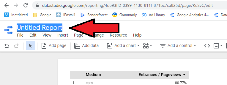
Name Your Report
Begin by setting up a name for your report on the top left corner, like “Google Analytics Report”, or whatever you like.
Select a Pre-Made Theme And Edit Your Layout
Click on “Theme and layout” from the top menu, and select one of the pre-made themes under the “Theme” tab (this tab is selected by default).
For this sample report, the theme we’ll be using is “Constellation” which has a dark background, but you can pick whichever you like.
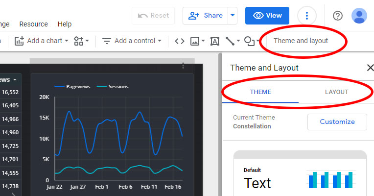
Click on the “Layout” tab so you can adjust things like document width and height.
For this sample report, we’ll be using the following Layout settings:
- Display mode: Actual size
- Width: 750
- Height: 830
Pro tip: If you want a “responsive” report, consider the “Fit to width” display mode and a smaller document width, which is what I use when designing for both desktop and mobile devices. However, it takes a lot longer to create the report.
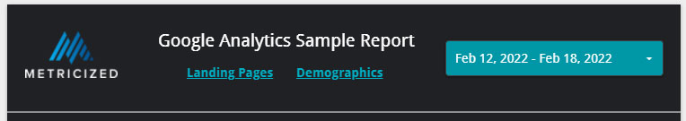
Adding a Header Section to your Looker Studio Report
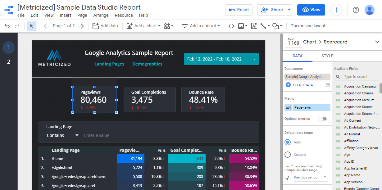
To begin designing the report, we’re going to include a basic header which will consist of a logo, a report title, a simple menu, a date range control, and a divider to separate it from the document body.
Start by making sure that there is sufficient space at the top for your header by selecting and dragging down anything you don’t need like tables and charts.
Add a Logo to Your Report
To add a logo, locate the image icon in the top menu and select “Upload from computer” to locate your logo (if it’s a PNG with transparency, even better). Resize the logo and drag it to the top left corner as shown in the sample above.
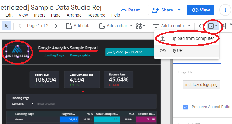
With the logo selected and under the Data tab on the right-hand side, you can include a custom URL, such as to your website. Then click on the Style tab, select the background icon and click on Transparent if your logo or image has a transparent background. You can also use a transparent border.
To add a simple title, select the Text icon from the top menu and write a title for your report, such as “Google Analytics Report”. Highlight the text, increase the font size from the menu on the right panel to something like 20px, and center it right next to the logo.
Consider resizing the text container so that it matches the text inside to make it easy to accommodate and move around.
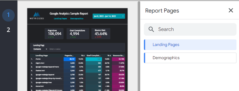
Adding New Pages To Your Report
From the top menu select Page > Manage Pages, and click the Plus sign at the bottom (right-hand size) to add a new page. Name your pages “Landing Pages” and “Demographics” respectively. You can then navigate to these pages by using the left-hand side numbered menu, which you can expand.
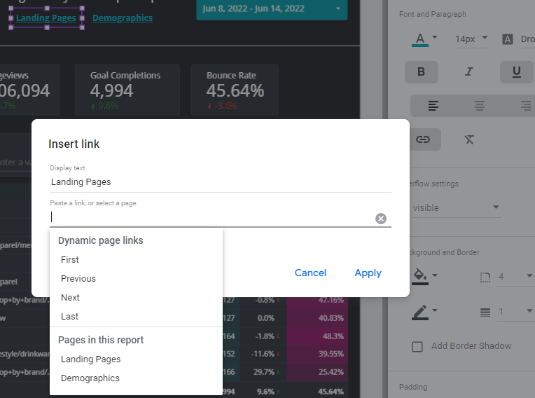
Add Custom Links To Your Report
Adding custom links to Looker Studio will allow you to link to internal pages within the report, as well as to external websites and resources (like we did for the logo).
If you want to add links to your report such as the ones in our sample report (top navigation for Landing Pages / Demographics), you can do so as well but it is unnecessary if you want to stick to Looker Studio’s built-in navigation links (the numbered pages on the left-hand side).
To add these optional links, you can add two text instances for two menu items, and name them “Landing Pages” and “Demographics,” just like the page names. Place them next to each other but underneath the report title.
Select both text items you created, and for each one (one at a time), add a link to their respective pages by selecting the Link icon on the right-hand side menu, which will allow you to link to pages within the report.
To style your links, you can select both text instances at the same time and make adjustments on the right-hand side menu so you don’t have to waste time styling them one at a time. You can do this because they are both text elements. If you were to try modifying different elements at once, like a text and an image, it wouldn’t let you modify their properties.
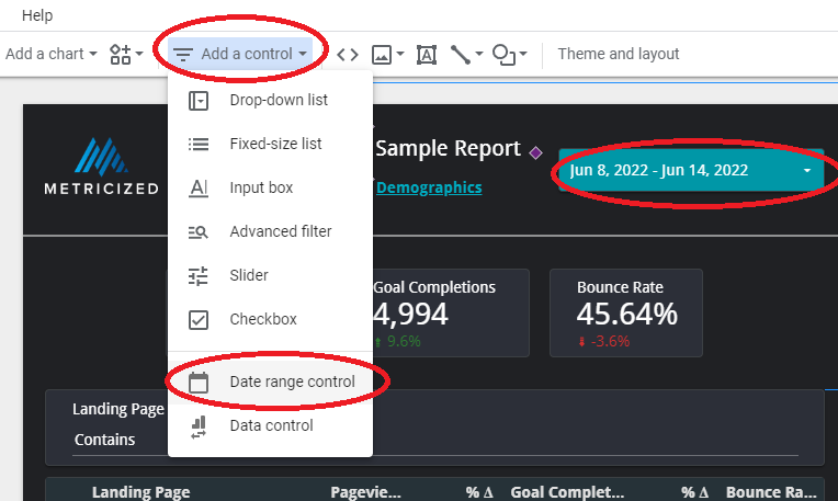
Add a Date Range Control to Your Report
To add a date range control to Looker Studio, from the top menu, select “Add a control”> “Date range control” and place it on the right side of the report next to the title. Select it and choose a default date range from the right-hand side panel, such as last week. Make any style adjustments to the date control as you see fit, such as adding a background color.
Add a Horizontal Line to Your Report
Next, select the Line icon from the top menu, and from the left corner of the document, keep pressing down your left mouse button, then drag it to the right edge of the page and let go once you have a steady line.
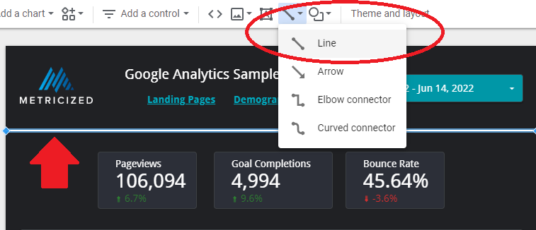
You can change the line settings on the right-hand side panel. Make sure it’s placed just under all the items we created for the header, so it serves as a divider.
Last but not least, select all of the header items (including the divider), right-click on any of the items, and select “Make report-level” so that they remain in place across all report pages. If your report is one page only, it would not be necessary to do this.
Best Practices When Designing a Looker Studio Report
Before we begin adding tables and charts, consider the following recommendations:
- Keep enough space between all your charts and tables and be consistent with your spacing.
- Keep your pages simple and try to focus on a unique set of KPIs for a specific topic, like Landing Pages (unless you are designing a comprehensive Overview page).
- Copy and paste any existing elements on your report for new sections, then change their properties so you don’t have to create new ones from scratch.
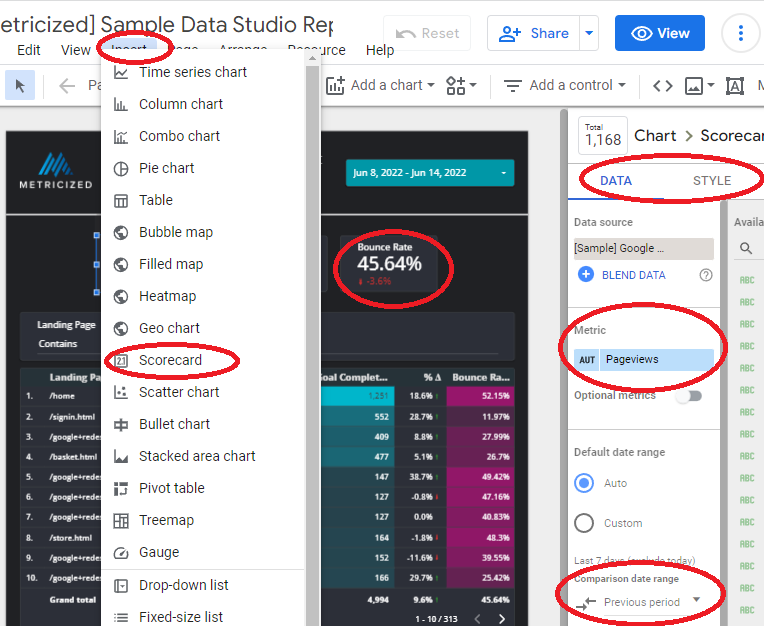
How to Add Scorecards to Your Looker Studio Report
Scorecards allow you to display the value of a single metric, so they are convenient for use as a quick reference and to show key performance indicators (KPIs).
- Let’s start by adding a few Scorecards right underneath the header. To do this, from the top menu, select Insert > Scorecard and click anywhere on the document to drop it.
- While still selected, you can change the Style on the right-hand side properties menu under “Style.” Once done with any design changes, copy and paste it (or duplicate it) two more times, so you have three scorecards in total.
- For each of the Scorecards, select a unique metric from the right-hand side panel related to what the report is about (in this case, landing pages), such as Pageviews, Goal completions, and Bounce rate.
- To display data for a previous period, while your scorecards are selected and on the right side menu, under “Default date range,” find where it says “Comparison date range” and select “previous period.” To remove a specific metric comparison, go to Style and uncheck “Compare.”
How to Add Tables to Your Looker Studio Report
Tables within Looker Studio allow you to visualize a large amount of data in a very easy-to-understand manner.
You’ll usually want to start with at least one dimension like date or landing pages, followed by a few metrics like users and pageviews.
You can also sort your data by clicking on the headings and adding custom styles to give your tables a nice look.
We’re going to add a table with the top landing pages.
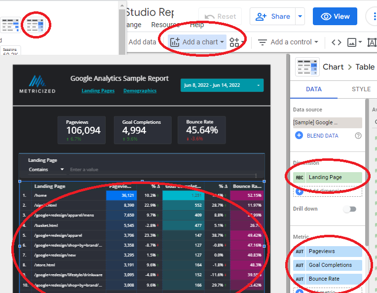
- From the top menu, click on “Add a chart” and then select one of the table templates right at the top, such as the table with heatmap. Resize the table to take the entire document’s width (minus any spacing you want to leave on the edges).
- With the table selected, adjust the Dimension on its properties located on the right side of the document and find and select “Landing Page.”
- Under Metrics, add three new metrics that match the previous scorecards. E.g., Pageviews, Goal completions, and Bounce rate.
- Find and check “Show summary row” and ensure that the Sorting is based on Pageviews. Under “Default date range,” find where it says “Comparison date range” and select “previous period.” To remove a specific metric comparison, go to Style and uncheck “Compare.” Just like we did for the Scorecards.
- Adjust the height of the table so that it shows at least ten entries. You can also change the default entries displayed (such as to only show 10) on the table properties. I suggest 100 or less so that your document does not take too long to load.
- With the table still selected, double-click on any vertical bar separating the dimension and metrics to let Looker Studio automatically assign a width. You can then manually adjust it as you see fit.
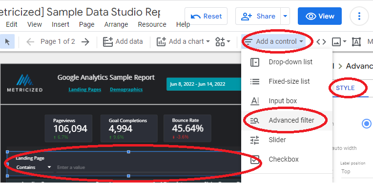
How to Add Advanced Filters to Your Looker Studio Tables
While you can sort table data by clicking on individual headings, you’ll gain even more control if you append a filter to it. This approach allows you to find specific data in real-time without having to scroll through all the entries in the table, which could be thousands.
- To add an advanced filter, from the top menu, select “Add a control” and then “Advanced filter”. You can adjust the Style on the right-hand side panel while the filter is still selected. For the “search type,” select “contains.” Leave the control as fixed-size.
- You can also add multiple filters by duplicating this filter and adjusting the filter control to match any other dimensions in the table but since we only have one dimension in this case, so we’ll keep one filter.
- Position the advanced filter just on top of the table we created and increase the width to match the table’s width. Make sure the dimension or “control field” for the filter is set to the same as the table’s dimension, “Landing Page.”
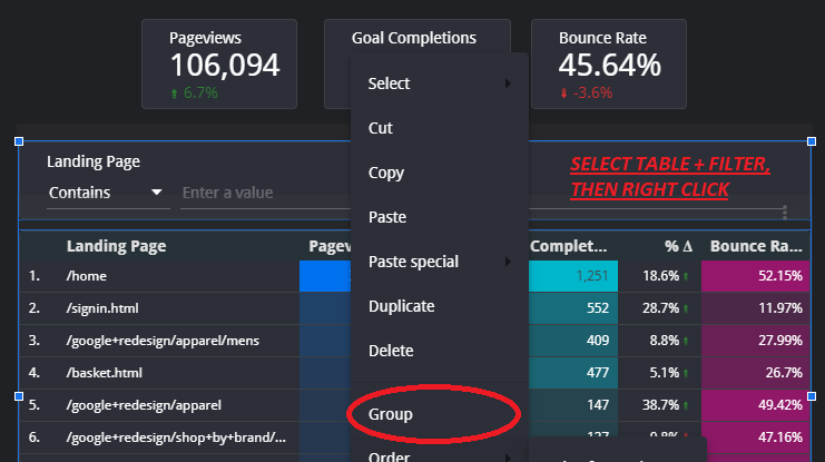
- You can now use the filter and type any common (or unique) value found in a landing page so that you only see that particular set of landing pages. However, you may have noticed that everything in the report gets updated when you use this tool. Luckily, there’s a way around this.
Grouping Multiple Objects in Looker Studio
Looker Studio allows you to group multiple objects for ease of use. For example, you can group an entire section of your report so you can drag and drop it quickly without having to select everything all the time.
This approach also allows you to control the data within specific document sections. For example, you can have a separate control filter added to a group to only change the updated values for that section when you update the control.
To combine multiple objects, select them, right-click any of the objects, and select “Group” or press CTRL + G. You can ungroup them by selecting “Ungroup” instead or pressing CTRL + SHIFT + G.
To edit grouped objects individually, you’ll need to double-click the object, but if you have to make several changes, it might be best to ungroup an object first until you’re finished. Also, note that you might not be able to group report-level objects, like the header section we made.
You can follow this approach to combine the table and the advanced filter so that the other objects in the document (like the Scorecards) do not change when you enter a value on your filter.
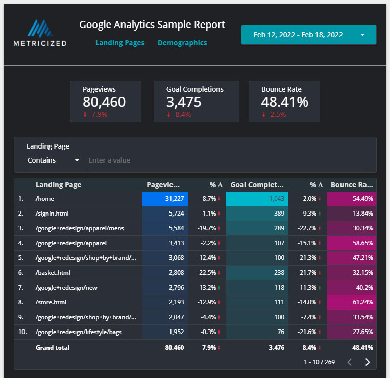
The first page is now complete; here’s a preview:
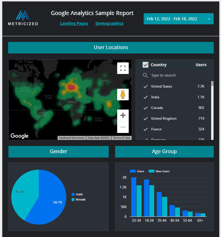
Setting Up The Demographics Page
Next up, we have our final page, Demographics, where we’ll start adding more illustrative elements like time series charts and a google map. We’ll also make this particular page just a little taller to accommodate more items. Make sure that you navigate to the second blank page from the menu on the left-hand side.
- To adjust the settings for a specific page, right-click on an empty spot in the document and click on “Adjust current page settings” to change its settings on the right panel. In this case, select the “Style” tab and set the height to 850 pixels to make it just a little bit taller.
- To add custom headings to Looker Studio, you can select the Text tool from the top menu and style it using the panel on the right-hand side. Let’s start by adding three headings for our three illustrative elements made up of 1 Google Map, 1 Pie chart, and 1 Column chart.
- For the first heading, select the text tool and extend it across the page from left to right, leaving some spaces in the edges. Make it about 40 pixels tall, 18px for the font size, center align the text, and add a solid background color from the Style tab. Let’s call this heading User Locations.
- Duplicate this heading but resize it to about 40% of the page width, duplicate this new resized heading again and place them both side by side under the full-width heading, leaving sufficient space. Let’s name these two new headings “Gender” and “Age Group” respectively.
- From the top menu, select “Add a chart,” and then under “Google Maps,” select “Heatmap.” Resize it to align with the full width heading but make the Map so that it only takes about 60% of its width. Set the dimension (Location) to “Region” on the right-hand side panel.
- From the top menu, select “Add a control” and then “Fixed-sized list” and place it just next to the Map we created so that it is about 30% of the report width. Set the dimension (Control field) to “Country” and the Metric to “Users”. This time around, do not group it with the Map so that all the data in the report changes based on the selected user’s location.
- From the top menu, select “Add a chart,” and then under “Pie,” select “Pie Chart.” Resize it so that it aligns with the half-page heading on the left side. Set the dimension to “Gender” and the Metric to “Users.”
- From the top menu, select “Add a chart,” and then under “Bar,” select “Column Chart.” Resize it so that it aligns with the half-page heading on the right side. Set the dimension to “Age” and add two metrics, one for “Users” and another for “New users.”
Our final page is now complete; here’s a preview:
Final report can be seen at the following URL:
https://datastudio.google.com/reporting/093b7947-51b3-472c-9d45-af0611bb1d60
Final Thoughts
If you followed along and finished the report, you are well on your way to fully creating your very own Looker Studio reports. It’ll also be easy for you to customize existing reports to which you have access.
If you want to use some pre-made templates for free, which are also easy to customize, you can check out our Free Looker Studio Templates.