
A useful Data Studio report does more than place charts on a page. It gives a specific reader the metrics, comparisons, and detail needed to answer a specific question.
This tutorial shows how to create a one-page GA4 website performance report with:
- four KPI cards;
- two 30-day trend charts;
- a date-range control; and
- a landing-page table.
The example uses Google's public GA4 Merchandise Store property, so you can follow the process without exposing client data. Google now calls the product Data Studio again; older guides and URLs may refer to the same product as Looker Studio.
How to create a Data Studio report
The complete process is:
- Decide who will use the report and what it must help them decide.
- Create a report and connect a GA4 property.
- Choose Freeform or Responsive layout.
- Set the canvas and theme.
- Add a date-range control.
- Add KPI cards, time series, and a detail table.
- Verify the source, date range, filters, comparisons, and totals.
- Open View mode and configure the appropriate sharing permissions.
The finished example is a 1,000-pixel-wide Freeform report. It is deliberately compact enough for an article and straightforward stakeholder review without being presented as a truly responsive mobile report.
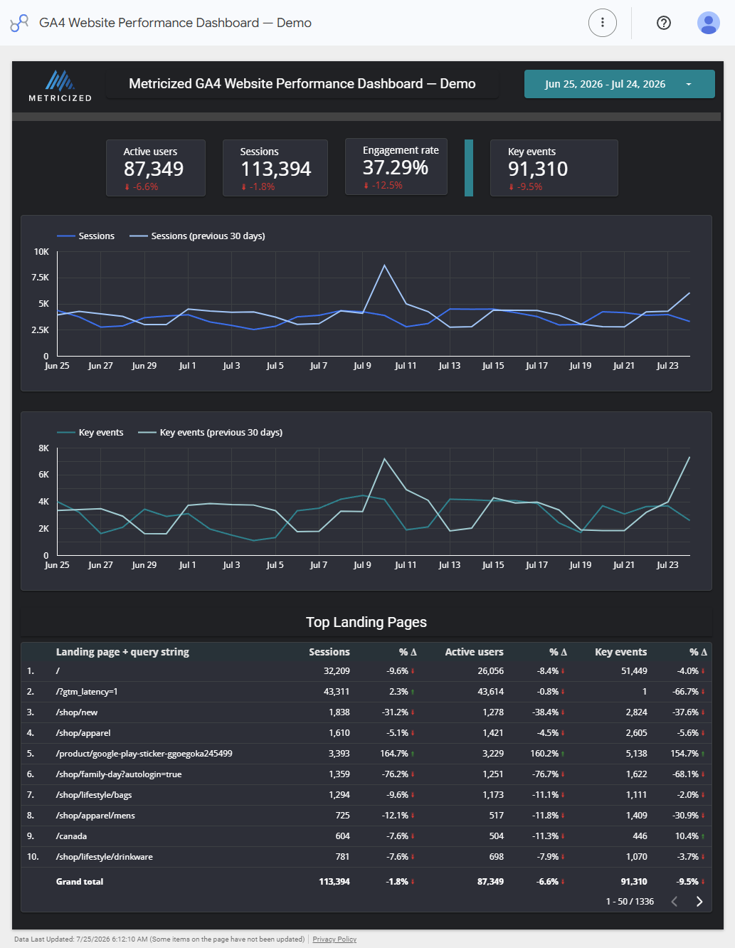
The completed Metricized example uses Google's public GA4 Merchandise Store demo data and a complete 30-day reporting period.
You can review and copy the maintained Metricized GA4 Data Studio template. The template page explains the demonstration source, connection steps, and validation boundary before opening the editable report.
Define the report before opening the editor
Start with four questions:
- Who will use the report?
- Which decision should it support?
- Which reporting period and comparison make that decision meaningful?
- Which business actions count as key events?
An owner may need a concise view of traffic, engagement, and important actions. A marketing specialist may also need channel, campaign, and landing-page detail. Trying to serve both audiences with every available metric usually produces a crowded report that neither audience can read quickly.
For this starter report, the intended reader needs to know:
- how many people used the website;
- how many sessions occurred;
- whether those sessions were engaged;
- how many configured key events occurred;
- whether sessions and key events changed from the previous period; and
- which landing pages contributed the most activity.
The report can become more specialized later. Defining the first useful question keeps the initial build manageable.
Create a report and connect GA4
From the Data Studio home page, select Create > Report. The new report opens with the Add data to report panel.
Select the Google Analytics connector built by Google. Authorize access when prompted, then choose the appropriate Analytics account and GA4 property.
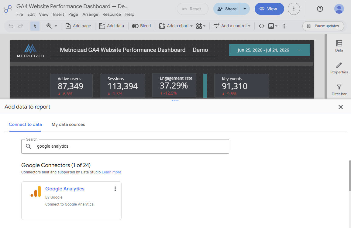
Use the Google Analytics connector built by Google, then select the intended GA4 property.
To reproduce this example, use Demo Account > GA4 – Google Merch Shop. Google explains how to obtain access in its Analytics demo-account documentation. For a business report, use a property you are authorized to access.
Name the report immediately. A useful name identifies the source or purpose, not merely the software used to create it. The example is named GA4 Website Performance Dashboard — Demo.
Data Studio's native GA4 connector uses the Google Analytics Data API. It can report fields from the property, including supported custom fields, but it does not reproduce every GA4 exploration, segment, or comparison. It is also subject to Data API quotas. These constraints matter when you validate the finished report.
Choose Freeform or Responsive
Open Theme and layout, select the Layout tab, and choose the report's layout mode.
| Choose Freeform when | Choose Responsive when |
|---|---|
| Exact desktop placement matters | Regular phone and tablet use matters |
| The report needs a predictable PDF layout | Components should reflow across screen sizes |
| Report-level components are required | Section-based filtering fits the design |
| You need precise control over canvas size | Automatic layout is more important than pixel-level placement |
This tutorial uses Freeform. It is Data Studio's default layout and provides the positioning and canvas control used by the example.
Responsive is not simply Freeform with Fit to width enabled. It uses a different section-based layout and does not support every Freeform behavior, including report-level components, overlapping components, or custom canvas sizing. Google currently labels Responsive as Preview, so verify its limitations against the report you intend to maintain.
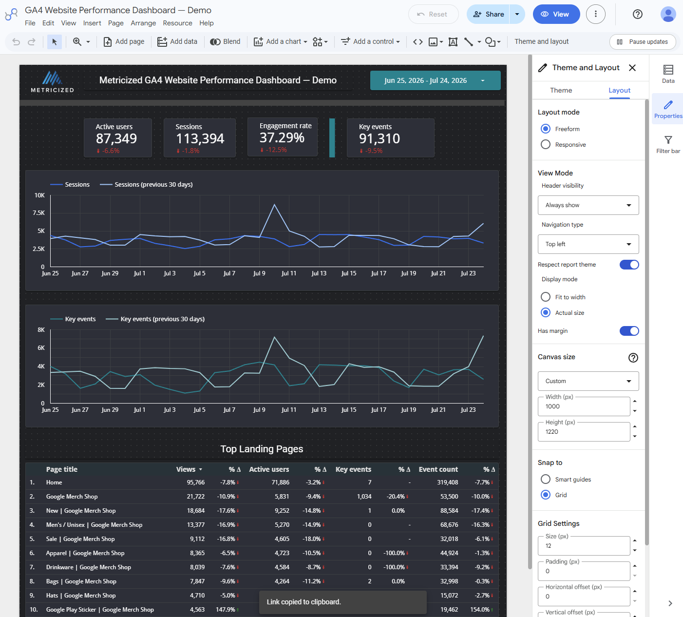
The example uses Freeform with a 1,000-by-1,220-pixel custom canvas. The temporary clipboard message in the screenshot is unrelated to layout.
Set the Freeform page size
Under Canvas size, choose a preset or Custom. The example uses:
- Width: 1,000 pixels
- Height: 1,220 pixels
- Display mode while editing: Actual size
Choose the height after estimating the report's components. Excessive empty space makes a report feel unfinished, while a canvas that is too short forces charts and tables into an unreadable arrangement.
A narrower Freeform canvas can scale more gracefully than a very wide desktop report, but it does not become responsive. Test the report at the screen sizes your audience actually uses.
Select or customize a theme
The Theme tab provides predefined report themes and a customizable default. Use a theme as a starting system for:
- background and component colors;
- chart palettes;
- typography;
- borders and shadows; and
- default control styling.
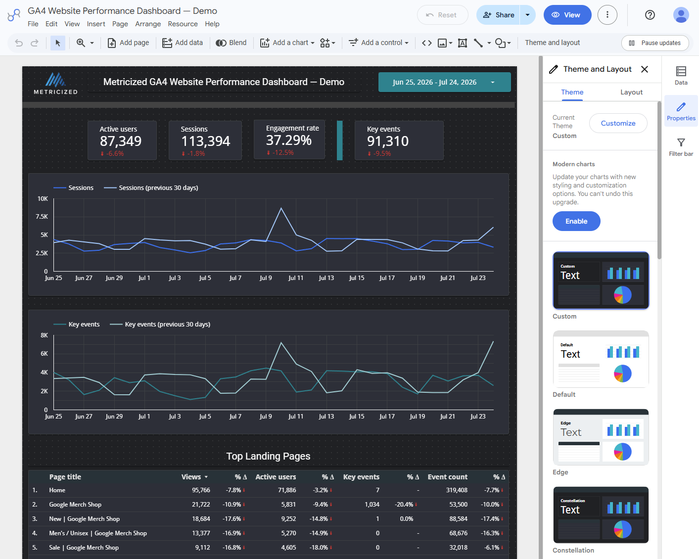
Choose a consistent starting theme, then customize only the properties needed for the report's hierarchy and readability.
The example uses a restrained dark theme with teal and blue accents. The specific colors are less important than consistency, readable contrast, and clear comparison states.
Avoid assigning a different accent color to every metric. Color should help readers distinguish meaning, not compensate for weak labels or a cluttered layout.
Understand the report editor
The report canvas occupies the main editor area. The toolbar adds data, charts, controls, text, images, and other components. Selecting a component opens its setup and style properties in the panel on the right.
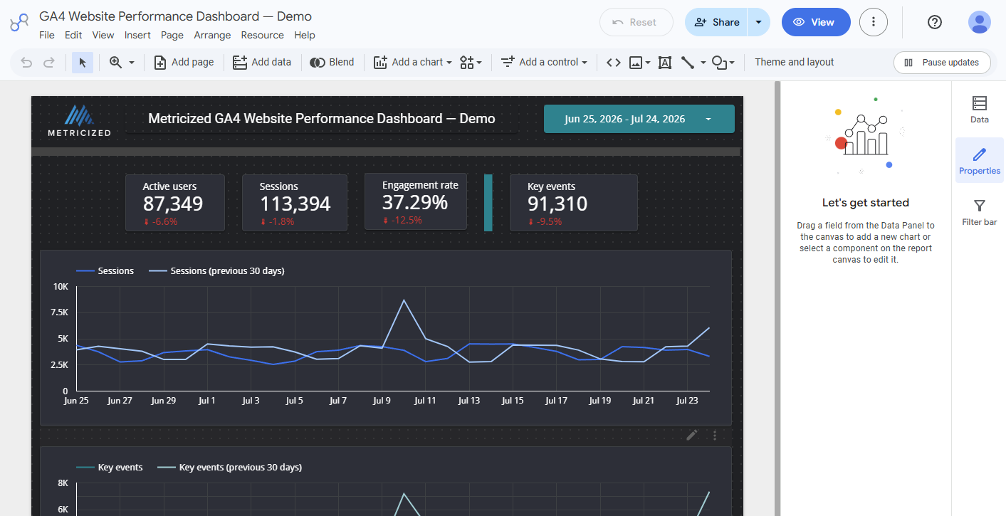
Select a component to configure its data and appearance in the properties panel.
Build the report in reading order:
- identity and date context;
- summary KPIs;
- trends;
- supporting detail; and
- source or update notes.
This hierarchy lets a reader stop after the summary or continue into the detail when a result requires investigation.
Add the KPI scorecards
Use Add a chart > Scorecard, then assign a primary metric in the Setup panel. Configure one card correctly before duplicating and changing its metric.
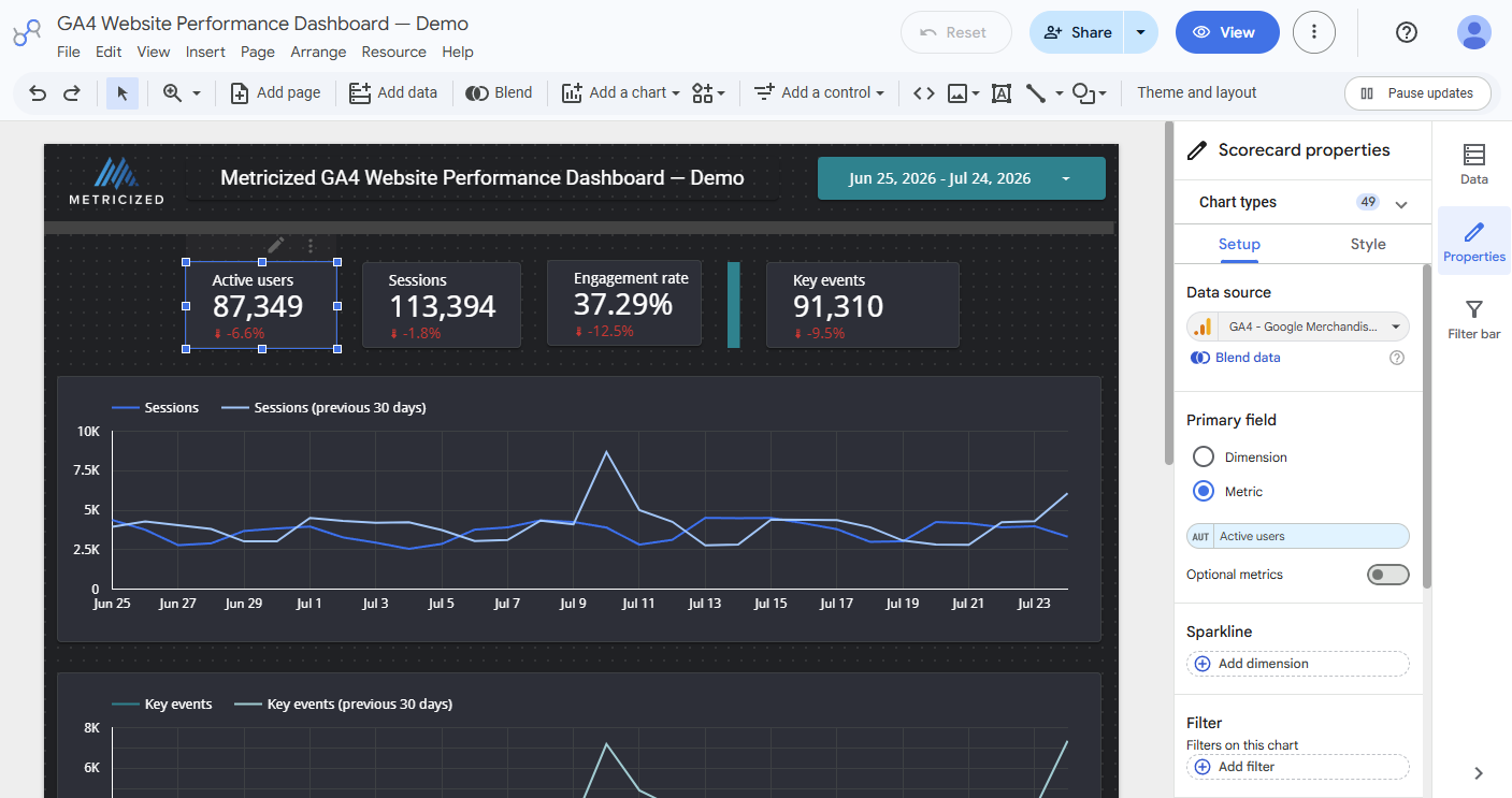
Configure the data source and primary metric for one scorecard, then repeat the pattern for the remaining KPIs.
The example uses:
Active users
The distinct users who engaged with the website during the selected period. Use this as a people-oriented summary, but remember that analytics identities are measurement constructs rather than a perfect count of individual humans.
Sessions
The visits that began during the selected period. Sessions provide a useful traffic-volume measure and are also the primary metric in the landing-page table.
Engagement rate
The share of sessions that met GA4's engaged-session criteria. The metric adds behavioral context to traffic volume, but it should not be interpreted as a business outcome.
Key events
The events marked as important in the connected GA4 property. Key events are only meaningful when their definitions and implementation match the actions the business actually values.
Show a comparison with the previous period for each card. Label the comparison consistently and do not assume that every increase is good or every decrease is bad. Context determines the interpretation.
Add the trend charts
Use a time series with:
- Date as the dimension;
- Sessions as the metric; and
- the previous 30 days as the comparison period.
Duplicate the chart and replace Sessions with Key events.
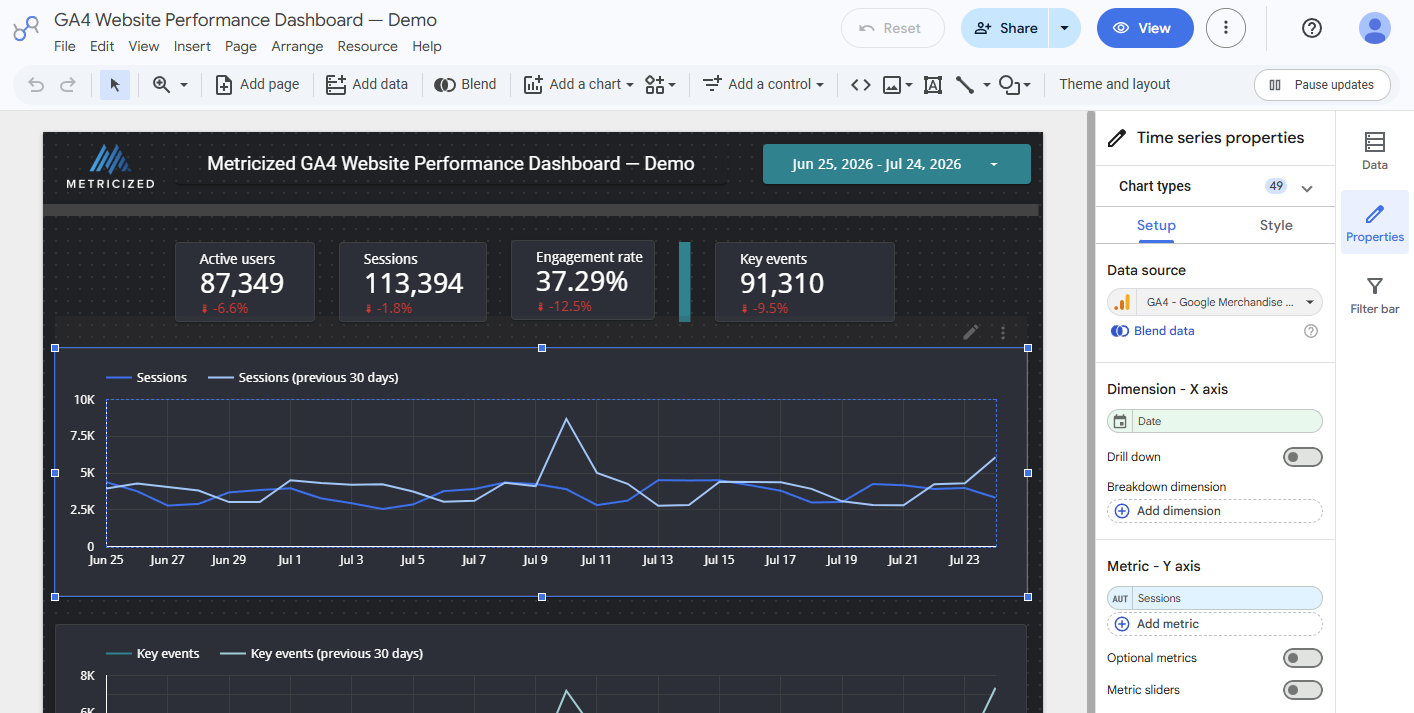
A time series adds the timing and shape that a scorecard total cannot show.
The example separates Sessions and Key events into two charts. That uses more vertical space, but it avoids forcing metrics with different scales and interpretations onto one axis.
Inspect peaks, declines, and gaps rather than treating the comparison percentage as the entire analysis. A reporting period can finish close to the previous total while containing an operationally important spike or drop.
Add the landing-page table
Add a table and use Landing page + query string as the dimension. The example includes:
- Sessions;
- Active users;
- Key events; and
- period-over-period comparison columns.
Enable the summary row so the visible detail can be read alongside the report-level total.
The choice between Landing page and Landing page + query string is intentional:
- Use Landing page when tracking parameters and other query strings should be consolidated into one path.
- Use Landing page + query string when the parameters identify genuinely different experiences or require diagnosis.
The public demo data illustrates the tradeoff: a latency-related query parameter appears as a separate row. A production report may need URL cleaning or a modeled landing-page field so incidental parameters do not fragment the results.
Do not label a Page title table as a landing-page table. Page title and Views describe content consumption, while landing page and Sessions describe where visits began.
Add and configure the date-range control
Use Add a control > Date range control. Set a useful default rather than requiring every viewer to configure the report before it says anything.
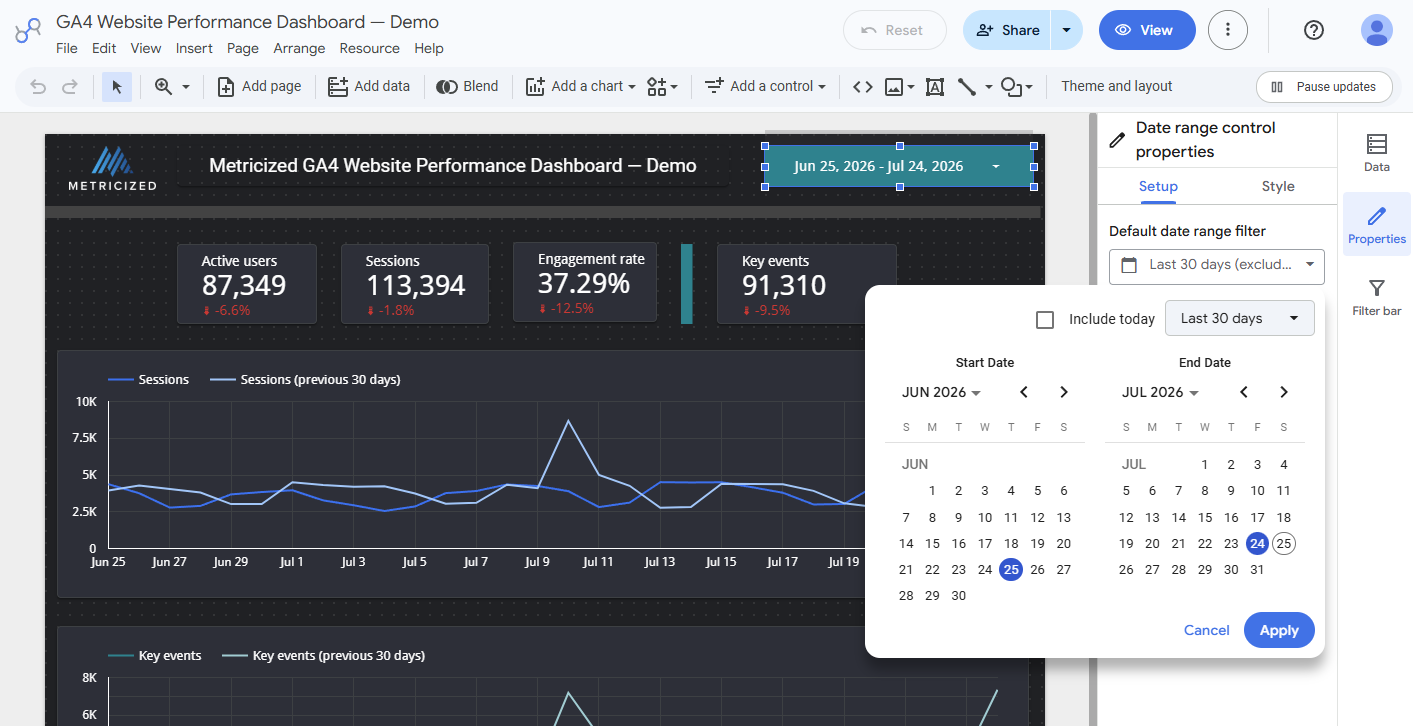
The example defaults to the last 30 complete days and excludes the current partial day.
Excluding today prevents an incomplete day from being compared with complete days. For monthly reporting, a completed calendar month may be more appropriate than a rolling period.
This one-page report needs only one date control. If you later add pages in a Freeform report, select a shared control and use Make report-level when it should appear and behave consistently across the entire report. Responsive reports use section- and page-based behavior instead.
Validate the report before sharing it
A chart rendering successfully does not establish that it is correct. Validate the finished report in this order:
- Confirm the intended GA4 account and property.
- Confirm the report date range and the comparison period.
- Check whether today or another partial period is included.
- Confirm the definitions and aggregation of every KPI.
- Compare representative totals with GA4 using the same date, filters, and reporting identity.
- Test the date control and any fixed chart filters.
- Inspect blank values,
(not set), query-string fragmentation, and unexpected landing pages. - Check for quota errors, system errors, or charts that did not refresh.
- Open View mode and verify labels, legends, contrast, and table pagination.
- Record the source and review date for a maintained template or client report.
Data Studio can match GA4 report data while still differing from GA4 explorations. Google's GA4 connector documentation describes current connector capabilities, quotas, and known limitations.
If the source tracking is unreliable, improving the dashboard design will only make the unreliable numbers more persuasive. Resolve material collection and definition problems before treating the report as a decision system.
Share the report deliberately
Open View mode and choose the narrowest access appropriate for the audience. View-only access is normally preferable for stakeholders who should explore the report without changing its structure.
The demonstration report is unlisted and allows a viewer to open the report link, but its owner has disabled copying and downloading. That is useful for a public example. A future downloadable template should use a separate, copy-enabled asset rather than weakening the demonstration report's access settings.
If a stakeholder needs a fixed reporting snapshot instead of interactive access, see How to Download a Data Studio Report as a PDF.
Frequently asked questions
Is Data Studio free?
Data Studio has a no-cost version and a paid Pro offering with additional organizational and delivery features. Connector, data-platform, and infrastructure costs can still apply even when the report itself uses the no-cost product.
Should I use Freeform or Responsive?
Use Freeform when exact desktop placement, custom canvas size, predictable PDF output, or report-level components matter. Use Responsive when regular phone-and-tablet use and automatic component reflow are more important. Test the current Responsive limitations before committing a maintained template to that layout.
Why can Data Studio totals differ from GA4?
Common causes include different dates, filters, reporting identities, dimensions, metric definitions, comparisons, and GA4 Data API behavior. Data Studio also does not recreate every GA4 exploration feature. Reconcile the same source, period, dimensions, and filters before investigating a true data problem.
Can one report use multiple data sources?
Yes. Data Studio can add multiple sources and blend data, but joins, aggregation, credentials, refresh behavior, and source ownership introduce additional failure points. Build and validate each source independently before combining them.
What is the difference between a report and a dashboard?
Data Studio uses report for the asset you create. A report may contain one dashboard-style page or several pages. In practice, dashboard usually means a concise interactive view, while report can also describe a longer, multi-section reporting deliverable.
Build from a trustworthy starting point
The mechanics of creating scorecards and charts are the easy part. A report becomes useful when its fields, comparisons, layout, and source data support a real decision—and when someone remains responsible for validating it as the underlying measurement changes.
For the current product workflow and layout options, review Google's Create a report and Create a responsive report documentation.